OriginalShift
A brand refresh for Original Shift, a digital publication specialising in educational, long-form content at the intersection of culture, art, and fashion, contextualising the present through the lens of the past.
00

problem
Original Shift’s equity came from its content. Its research, analysis, and cultural documentation built a loyal following by reframing the past through the lens of the present. But without a defined visual system, signature iconography, or an ownable wordmark, the publication had no consistent visual signal for its audience to recognise. In a crowded category, it blended in at a glance, and the basic monochrome palette only reinforced that sameness. The issue wasn’t the quality of the editorial, it was that the brand lacked distinctive assets it could truly own and repeat across every touchpoint.
solution
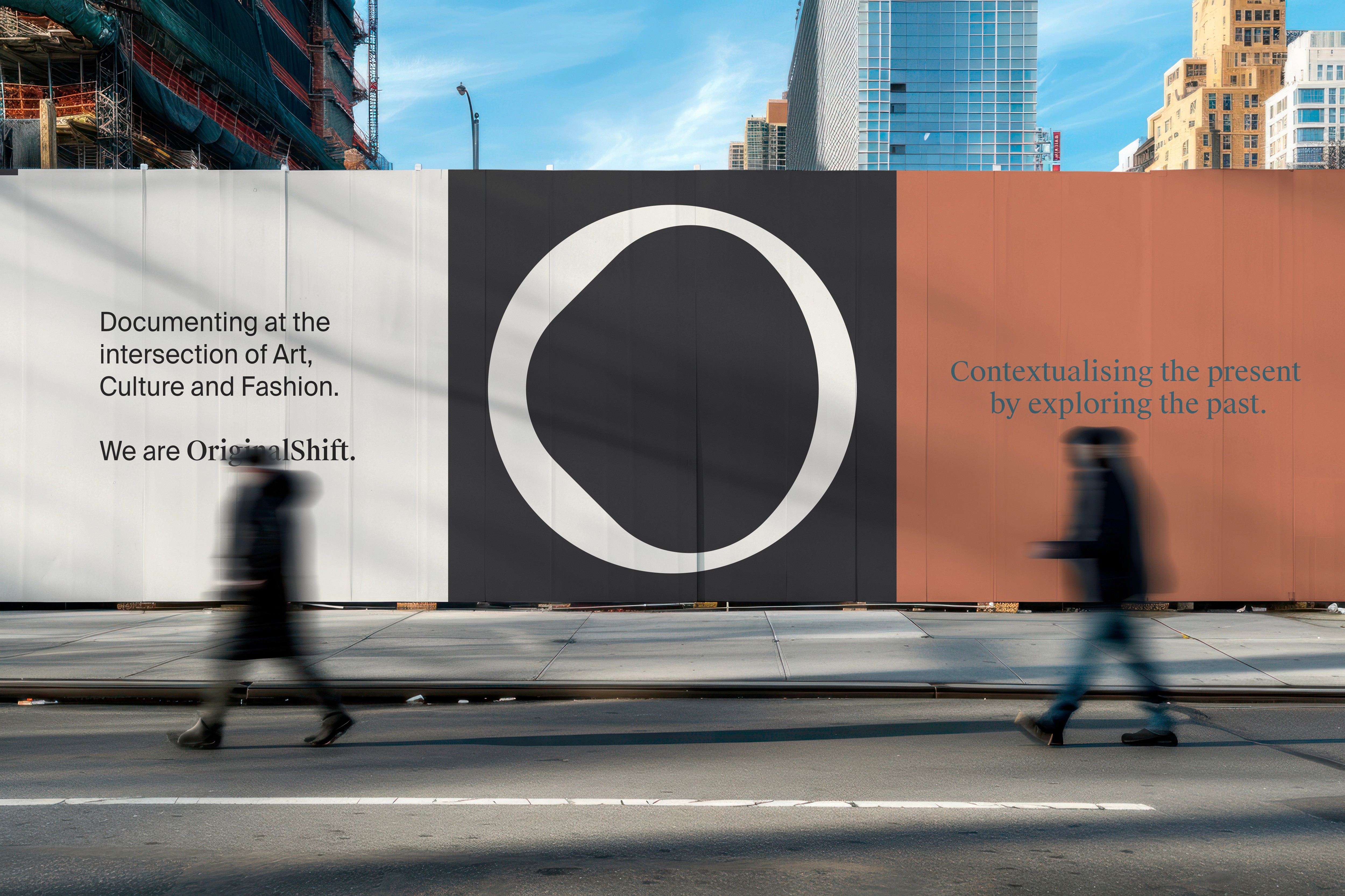
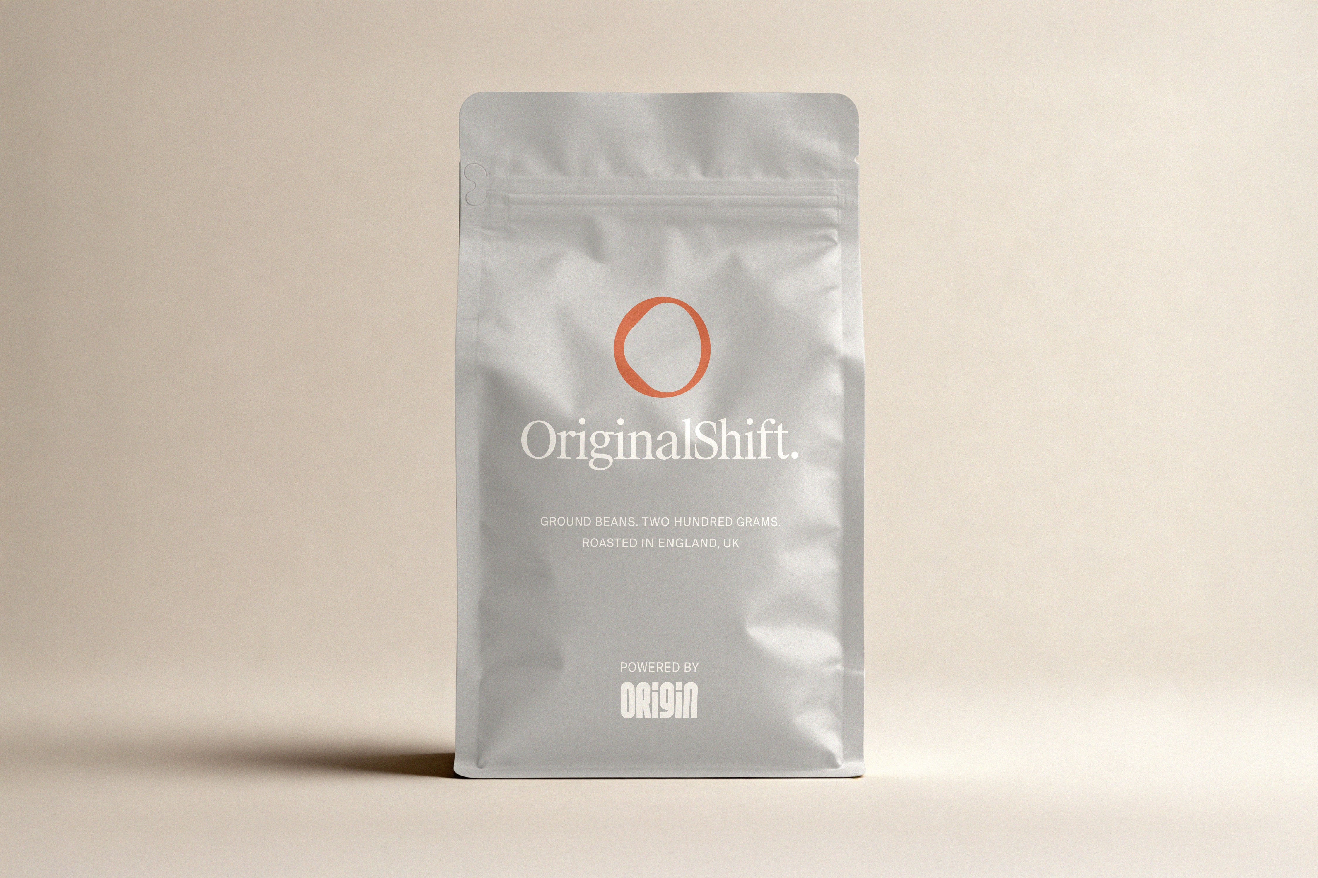
Our solution was a full identity refresh built for consistency and scale. We created timeless, ownable assets, from an icon and refined wordmark through to a complete visual system designed to perform across digital-first outputs now, and extend naturally into physical applications over time.
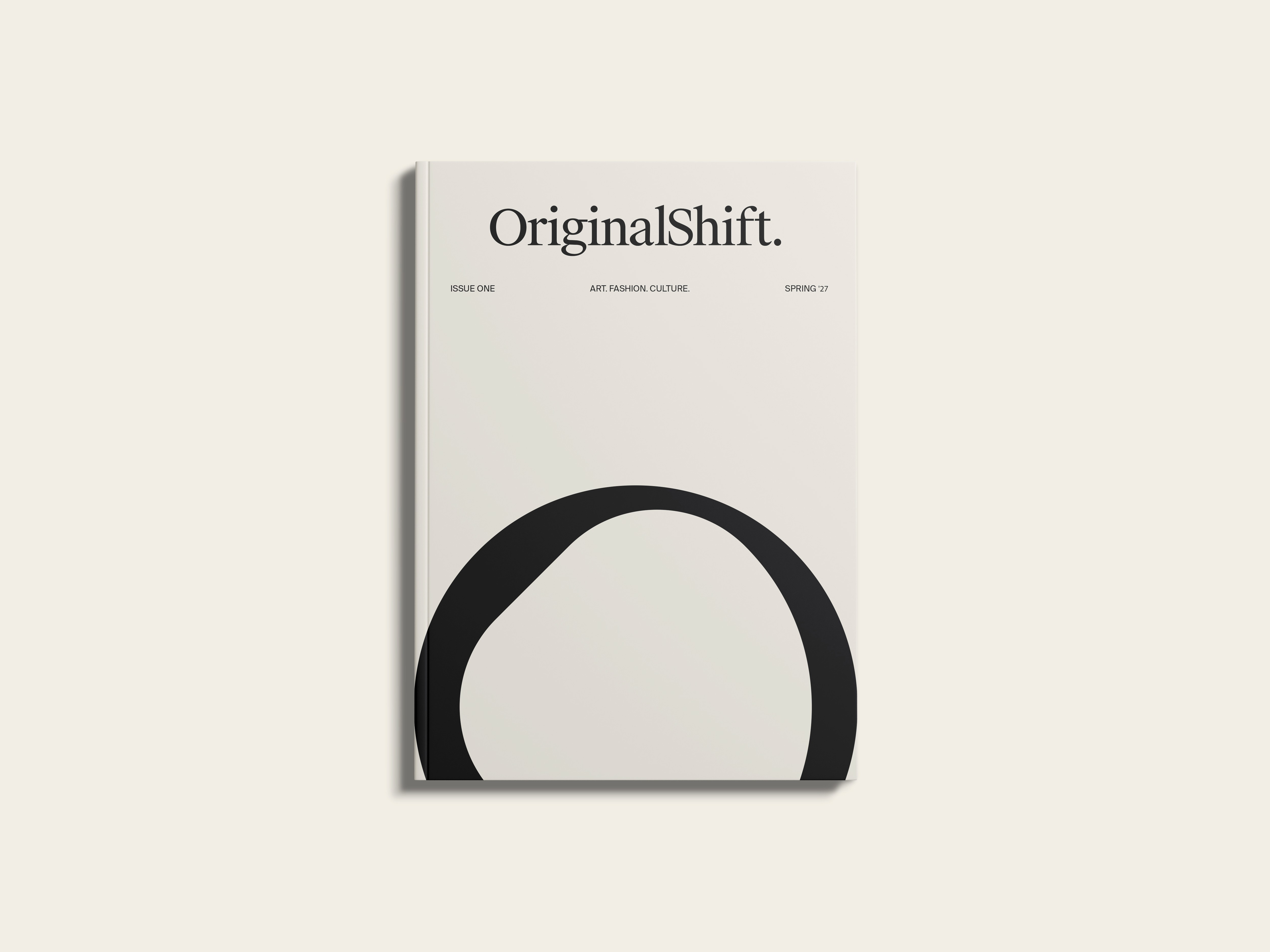
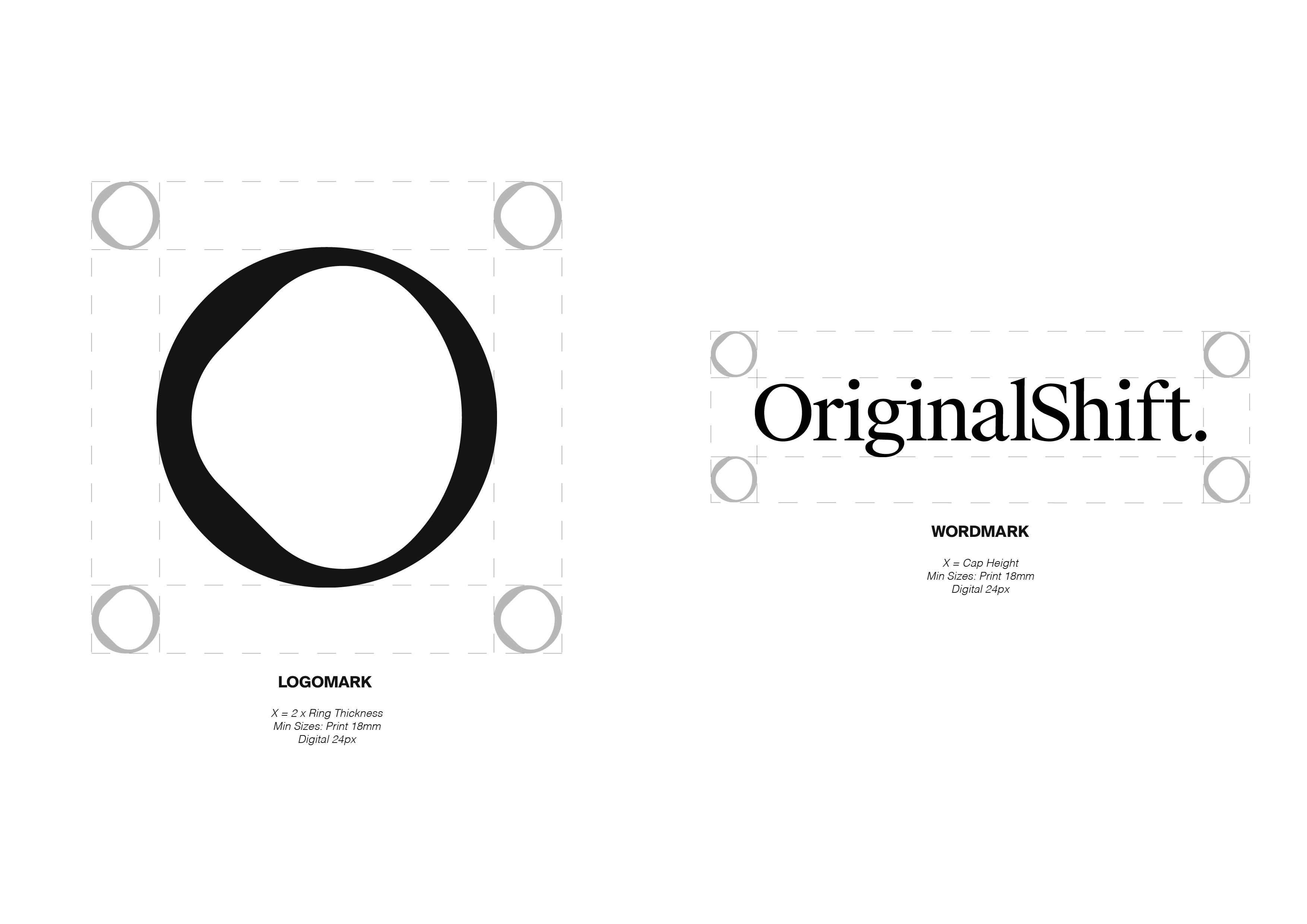
Culture shifts fast — the mark captures that movement on one side, and the edit on the other. A continuous loop for return, progression, and re-framing the present through what came before.
I approached the mark as a living symbol. Starting from a simple “O,” we refined the form through reduction and optical adjustment until it felt balanced, ownable, and repeatable across formats. The intentional asymmetry reflects the fluid nature of culture and information in motion, while the more resolved right side represents Original Shift’s editorial role: to fine-tune, curate, and shape that movement into a clear, digestible story. As a continuous loop, the mark signals return and progression, re-framing culture from the past through the lens of the present.
01
02
03

04
05

06
07

08

09

see also


